My Search for a new Linux Desktop Environment
So I’m not in love with Gnome 3, I actually use Gnome Classic as a desktop. I’ve been having some issues with Classic view as well. So I went on an exploration trip for a new Desktop, I’ve tried Mate (Basically Gnome 2), Xfce, KDE, LXQt, LXDE and Cinnamon.
I decided to load them into a VM and tried QEMU/ KVM I couldn’t get it to allow internet connection, so I wound up using Gnome Boxes. I didn’t use VirtualBox or VMWare because the machine I’m using is pretty wimpy, and I was trying for lean and mean. I had tried both of them and because the computer I’m using has a severe case of slowness, they locked the machine (damn resource hogs anyway) or pegged my poor little CPU.
Either way, Gnome Boxes did the trick and allowed me to create VM images and separate installations of each Desktop environment.
I used Debian Bookworm’s net install “CD” to install most of the VM images I created.
So here we go with what I’ve found so far.
Mate Desktop Environment
I like it, it takes me back to the good old days of Gnome 2. Probably because it is that, it’s a continuation of the Gnome 2 Desktop Environment project, actually.
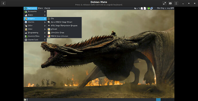
I love the fact the menu is organized so far. I haven’t installed a lot of things yet so we’ll see if it changes as I add things.
Below is a Screenshot of the desktop and the Mate Terminal. Notice how the font colors change for directories and actually does it on words like for and other words found in programming languages.
Or as I like to call it; has a Linux style terminal instead of a Microsoft style terminal.
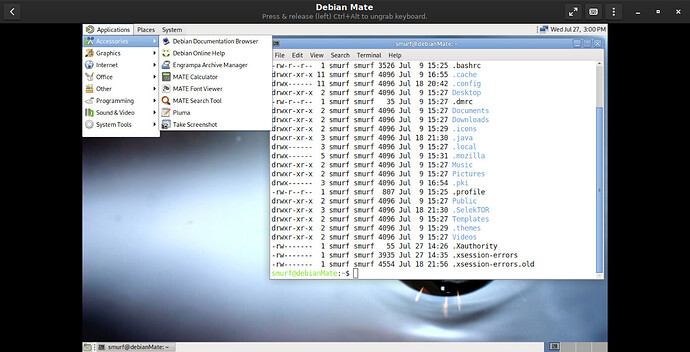
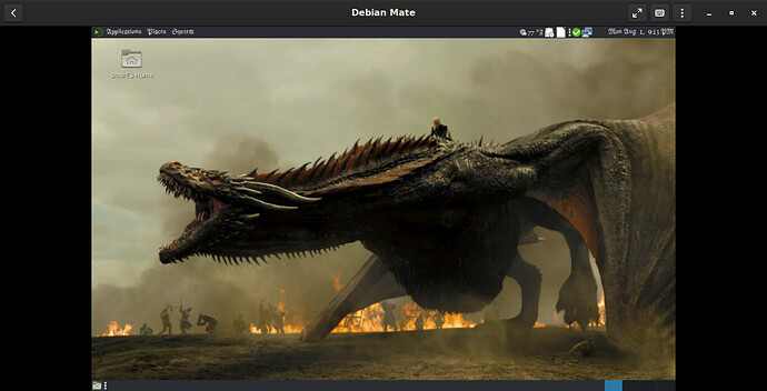
So I played around a little more with Mate, You can add things to the top bar (panel) and they appear on the left of the clock & Network Icons, I found a font I liked also, I had to go to wallpapersafari.com for the Dragon. Yes, Gnome / Mate could use some artists like KDE has (Heavy SIGH) someday they’ll get artists someday.
Anyway, the only thing I don’t like is you can’t center the clock anymore on the top panel, however; if I remember correctly, it was a royal pain to keep it there, so maybe they dropped the idea.
Xfce Desktop Environment
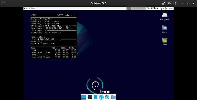
This DE (desktop Environment) has come a long ways since I used it last on Sun Solaris 8 and is pretty nice looking as well. By long way I mean like the distance from the Earth to Jupiter.
The menu is pretty good in organization, and they do the different colored text for Directories etc. as well. I don’t get the bottom bar/panel (?), but it still looks very nice. And it has a top bar that’s pretty functional, but if you add Widgets (or whatever they’re called) it doesn’t let you choose where, it just sticks them on the right-hand side (after the username) whether you like it or not (Pinko commie bastards anyway… hmm).
KDE Desktop Environment
It’s as close as you can get to Windows without actually running Windows. However; Plasma is very nice and seems to handle Graphics very well (it is on a Virtual Machine so it might not play nice on an actual machine).
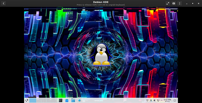
I will give KDE two things:
- The wallpaper selection is AMAZING, I guess the artsy type use this DE.
- Their update tool should be the standard, HOLY TUNA IT IS NICE!!! It called “Apper” and uses “Discover” to manage it. If it’s not listed in there it’s one of three things:
a) You’re in the wrong category
b) It’s not available for your Distro
c) The software doesn’t exist.
I didn’t install Snap or Flatpak, so I couldn’t speak to that, but the organization, categorizing, and descriptions … OH MOMMY, I’m in HEAT!! Why oh why can’t the others do that!? The other part of this called “Discover” it has all the details about the apps:
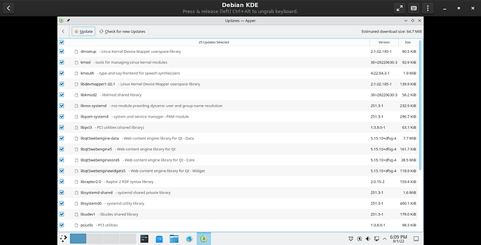
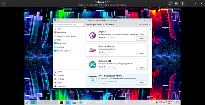
I only have a couple of things to be nitpicky about,
1) When I was installing it, I received a Security warning about Encfs having multiple vulnerabilities:
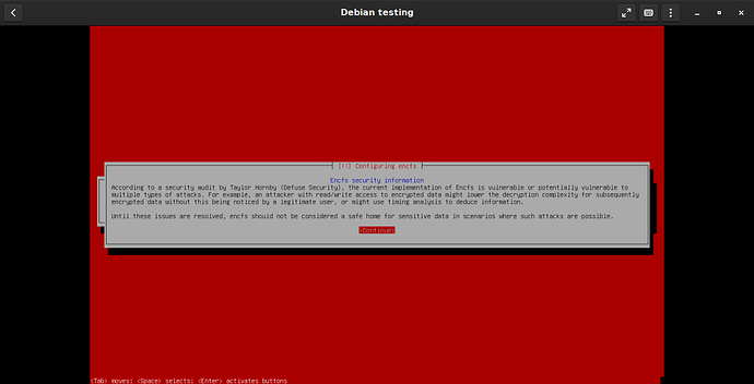
2) The Application Launcher Icon (lower-left corner) they should have stayed with the “K” emblem and not whatever the thing in the lower-left corner is supposed to be.
3) The number of packages installed by default; 1,698 of them, the others I tried were around 1,200 – 1,250.
LXQt Desktop Environment
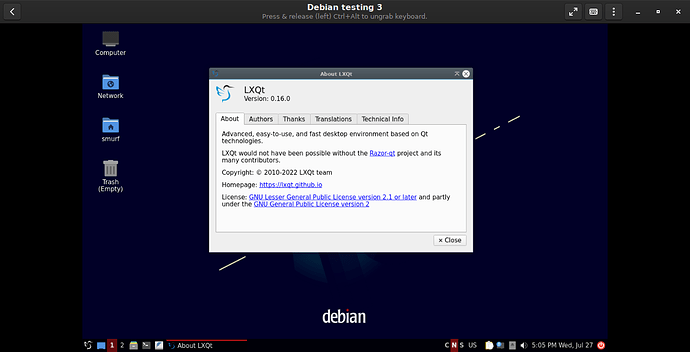
It’s okay, I like the fact LXQt gives Desktop Icons and it sort of allows customization, but not my favorite.
LXDE Desktop Environment
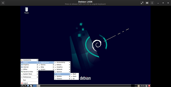
Well, I didn’t need a cold shower after this one either, but LXDE is not too bad. I’m not in love with the cascading menus (Can anyone say Windows 98? I knew you could) I actually did not miss that “feature” when it went away… at all. I didn’t remember how much I disliked it until I installed this DE, then I remembered what a P.I.A it was (but it’s still better than Windows 10’s “Menu”). And I really dislike where the “Leave” button is (aka Power button) on the lower right. Especially when the same options are in the app launcher (lower-left corner), let’s not visit the department of redundant actions from the redundant department of redundancy, please? And no top bar or any way to add it.
If you want a different Wallpaper than what comes with the installation, you’ll have to Google one up or have a Wallpaper site to get it from. Then again, you could go to KDE’s Web site and grab one of those too, I guess.
I was going to check out Cinnamon but after Mint with a Cinnamon/ Mate desktop I decided against it. I wasn’t very impressed with it, if it’s your cup of tea, more power to you but I wasn’t wanting more of it after about 2 minutes. But for the Linux newbie, definitely the one to use. If it leaves you baffled on how to use it, please go get a MAC (just kidding, don’t be going all ballistic over it).
I’m sure you’re wondering what I dislike about Gnome 3, well, I am thinking I’m going to switch to Mate. I like it better (I missed having a top panel that’s usable) When Gnome 3 is available for a Mobile device I’ll probably use it then.
Here’s the default installation and part of why I don’t like Gnome3.
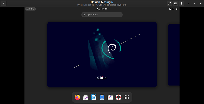
So when you first sign in you get this screen, you can either click on a desktop or the application you want. You can also click on the 3×3 dots (I think it’s called a waffle?) to see all your apps, which looks like this:
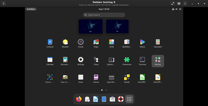
From here you can either search for the application or scroll through them until you find what you need. It’d be good on a smartphone or other mobile device, but it’s absolutely horrid on a desktop.
It does have a normal “Gnome” backgrounds:
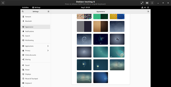
See my comments in KDE concerning artwork and wallpapers. Yes, Gnome could use some artsy types.
So basically, Gnome 3 has been converted (for better or worse) to a mobile desktop environment. Okay, great, but they forgot the desktop functionality completely and it sucks rocks.
I am currently using Gnome Classic, and it’s not all it’s cracked up to be either.
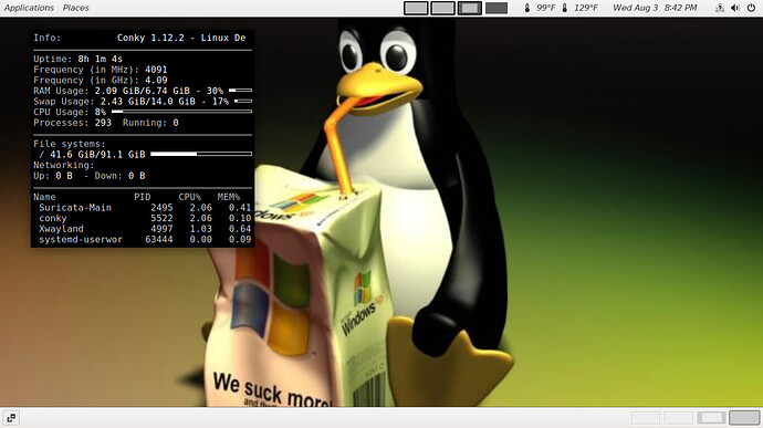
But it is more of a desktop environment than Gnome 3. Even with adding the Applications extension the menu is a horrid, disorganized mess:
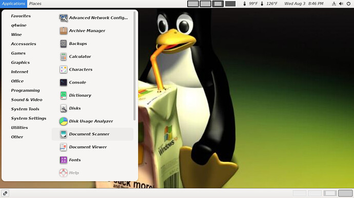
There are things that are in 2 or 3 different sections as well as I can’t customize the menu to get it to where I want it (for example, SelekTOR is in 3 different categories, it really should be only in one of them).
So I’m probably going to go to Mate (it’s actually pronounced Ma-Tay as per the website mate-desktop.org), it seems to have more of what I want from a DE. I didn’t write this to discourage anyone from using whichever DE they want, I’m just throwing my opinions out there and giving my 2 cents.
Thanks for reading this, hopefully it was worth your time.
Related reading:
- 5 ‘other’ Independent Linux Distros You Should Try.
- Linux: We need Tiling Desktop Environments.
- Best Linux distro and Desktop Environment Combinations.
- Best Linux Distro.
About the Author — Tim McConnell has over 16 years of IT experience. His core competencies include patch management, system hardening, technical support, troubleshooting, software updates, and network connectivity issues. With expertise in various technologies, such as Linux, Microsoft, Salesforce, HL7, API, and JSON messages. He is passionate about solving complex IT problems and delivering high-quality solutions to customers.
Great read!
I like the list you’ve built here because it’s also very hardware friendly, and most of the DEs you list revolve around what you described at the outset.
From your list, XFCE mated (no pun intended) to i3wm is more my comfort zone. I can’t go back from the WM and its time saving shortcuts.

Sometimes I regret using i3 because since then, every DE choice depends on if I can set up a window manager and the same shortcuts.
Thanks for the link to that wallpapers website. My go-to for walls is: https://wallhaven.cc/
Maybe you wanna try out Budgie some time
it’s based on GTK, and uses many of the same components you already know from GNOME (e.g a fork of their Settings app)
Other than that, its highly extensible using tons of community made applets online, which can be used on panels
Alternatively, you should try out using extensions on GNOME, they allow you to change many (if not all) of the behaviors you’ve mentioned you dislike : P
I took a peek at both links, the i3wm looks pretty nice. Especially the panels all one one screen, that’s a great idea for single monitors. Then you can have multiple screens open and see things your working on side by side. I may have to try that on a VM and test it out, but I’d have to find a video with better sound, dude needs to turn up his mike (could be me or my system). I checked out the wall paper site you posted and it’s bookmarked, yeah I kinda liked it
Hi TGRush, Welcome to our little place.
I actually use Gnome Extensions, there’s not everything in there. I’ve heard of Budgie but it isn’t in the list when you install Debian (initially) I guess I should have screenshot the list it shows in Debian, eh, Hindsight 20/20 as usual.
Anyway is there a video or documentation on how to switch to it? I’d be interested in checking it out.
It’s definitely his mic. i had the same issue with video.